Below: The following four images show the shields I decided to draw as a guide.
Miller's Tale, Emily's painting with fart added by me.
Reeve's Tale, I painted this shield. After leaving it and looking at it again I decided to add some clouds to break up the blue, so it wasn't a harsh block of colour.
Man of Law's Tale, painted by Emily.
Shipman's Tale, I painted this one.
Prioress's Tale, I'm particularly pleased with the shadows, rays and blue gradient in this one, Emily painted this.
Nun's Priest's Tale, I painted this shield and enjoyed trying to create a feathery affect, I think it has been successful and will read from a distance.Yesterday I spent a late evening helping with the painting. I learnt a lot about scenic painting affects. Below are some pictures of the staining that I helped with.
Below: Using rockers to make MDF look like it has a wood grain.
Balcony wall with newly cut windows, I am making hessian curtains for these.
Stained benches, these need a layer of darker paint in a dry brush but they are looking much better already.
Floor in progress. I am really pleased with the design of the flooring as it works with the in the round set.
Staining using one bucket of water to wet the wood and one bucket of paint to apply the stain.
Chest staining.
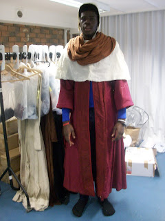
We had another fitting with Alex who is playing the Man of Law to test out the coif, cape and blue top to go underneath the gown.
I really like the snood (will be in cream for this character) and cape combination with this gown as it really gives a regal high class feel to it. The sleeves are a really good shape and I think the outfit works well as a whole.
Testing the movement in his costume, therefore making sure it is all suitable.
Slit at the back of the cape allows movement in the arms and creates and interesting shape.
Alex was pleased with the developments of his costume and I think as a designer it's really important that the actor feels the costume is an extension of their character and makes them feel like their character in terms of the weight of the fabric, cut, style, shape and colour. I think these elements are really important and it is very rewarding when you can look at a costume and feel as though it is an embodiment of that character.
I dyed a lot of elements of costume and set today and I am very pleased with the banners I have created for the Knight's tale as I think they will work really well in that tale along with the bunting.
Below: Red blood cloth for battle scene in Knight's tale.
I also had a production meeting for On The Razzle today and it appears in many respects to be a play and set very different to The Canterbury Tales. Farces are always quite difficult yet fun and interesting and I glad I get the chance to work on two very different plays.


No comments:
Post a Comment